
This feature has been released
This article describes functionality that is now available in PLAYipp.
Released: 29 Sep 2026
Questions? Don't hesitate to contact our support.
We have made a visual update to PLAYipp to make the interface clearer and more modern. As part of this, some changes are also being made to the structure of the main menu, and the shortcuts to settings and the playlist are being removed from the tree view. Here is an overview of what's new.
Table of contents
- New design in the main menu
- Updated design in the tree structure
- Updated design in the screen list
- What this means for you
New design in the main menu
The main menu has an updated look with clearer icons and improved structure. The menu is also changing position, it used to be located on the left side of the interface and is now moving to the top. Some menu options that were previously under Signage now have their own entries directly in the main menu:
- Screens and screen groups now have their own menu entries directly in the main menu
- Quicknote templates, screen layouts, and Branding move into a new menu entry for design resources
- Heartbeat moves under Administration

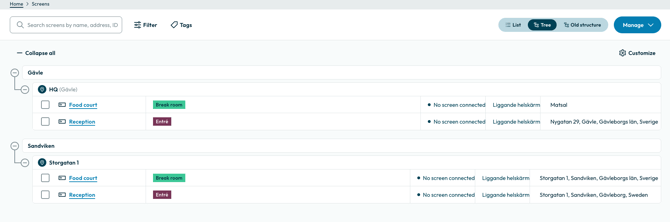
Updated design in the tree structure
The tree structure, which is based on our geographic screen structure, has a new visual style for better readability.
The shortcuts to settings and the playlist are being removed from the tree view as part of this update.
Updated design in the screen list
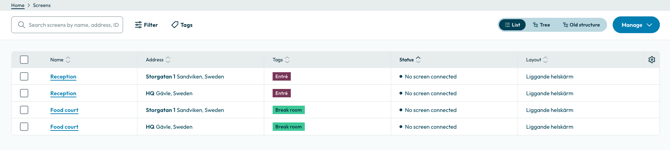
The screen list has also been updated visually, with a cleaner and clearer look. The information shown and how you interact with the list remain the same as before.
What this means for you
There is nothing you need to do to start using the new design. You will still recognize the interface, just with a fresher look. Please note that the shortcuts to settings and the playlist in the tree view will be removed as part of this update.